Display a Tooltip on Mouse Hover
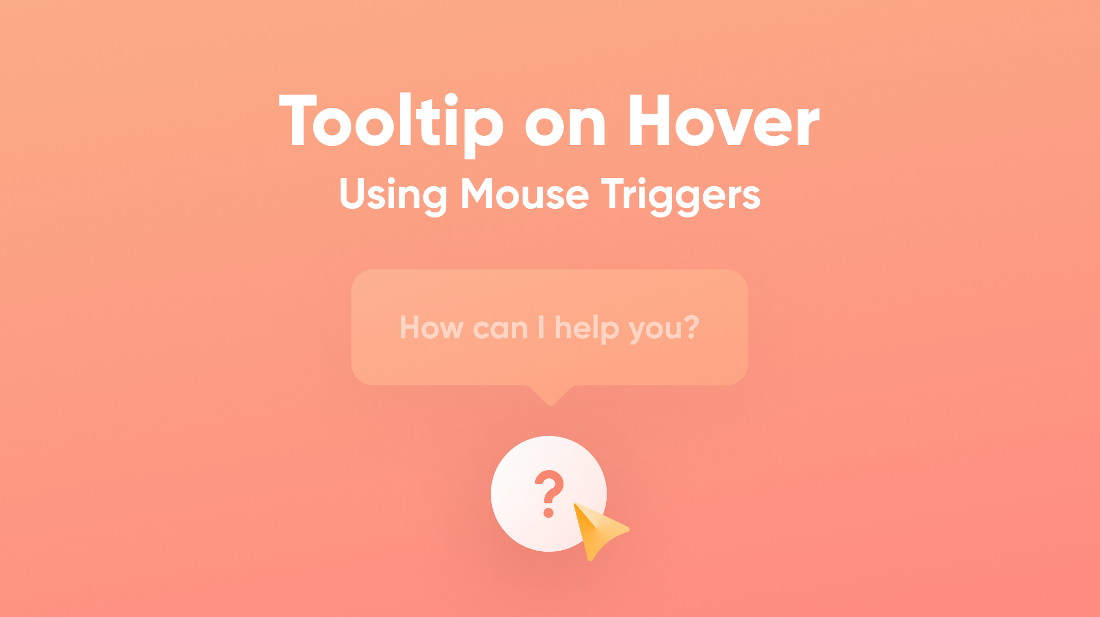
You will learn how to make a tooltip appear after hovering the mouse over a button and disappear when you move it away from the button.

Introduction
Tooltips are short messages that are usually used in interface design to provide additional context and guide the user into taking context-specific actions. These tooltips can be triggered by hovering the mouse on specific UI elements such as buttons, icons, etc. This effect can be easily achieved in ProtoPie using the Mouse Over and Mouse Out triggers with specific opacity responses. We'll be providing more tips on how to make the tooltip work seamlessly in your prototype.
What you will learn
In this lesson, you'll learn how to:
- Make a mouse-over state for the question mark button
- Make a mouse-out state for the question mark button
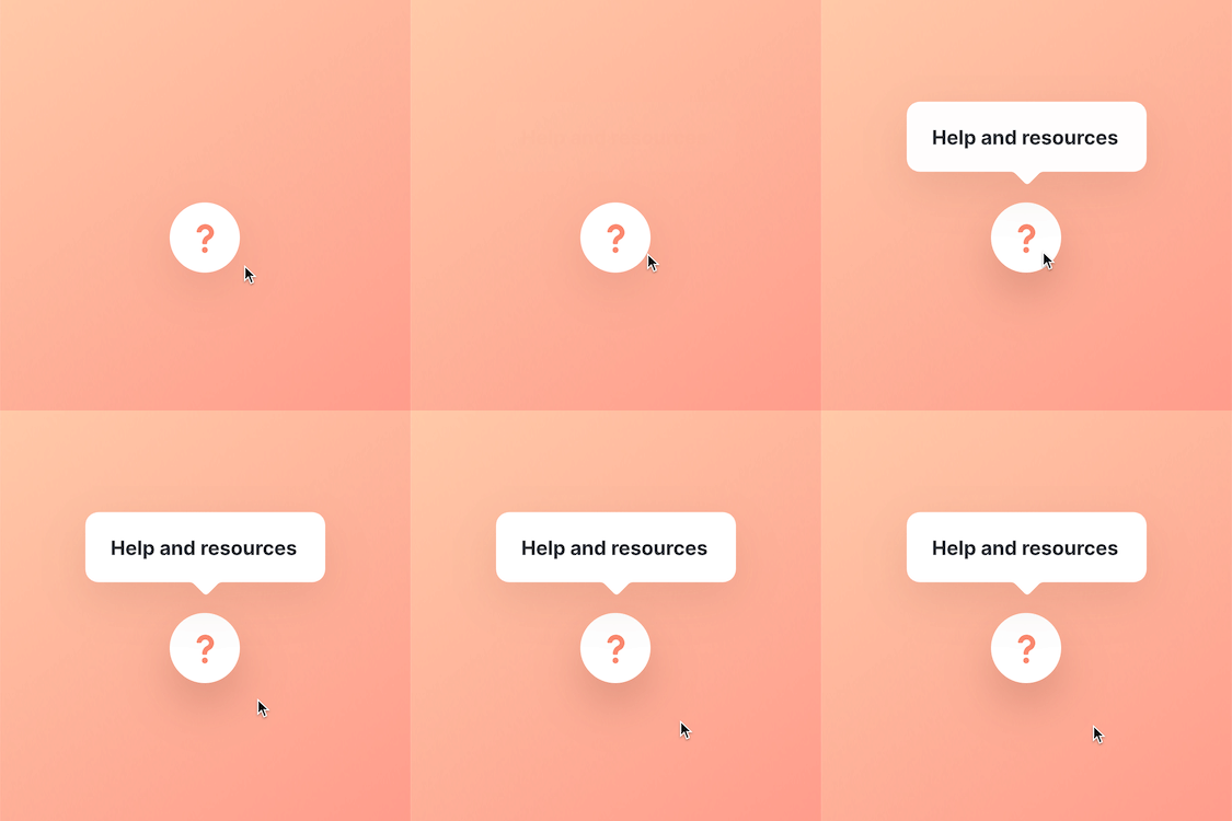
In the end, you’ll be able to make something like this!
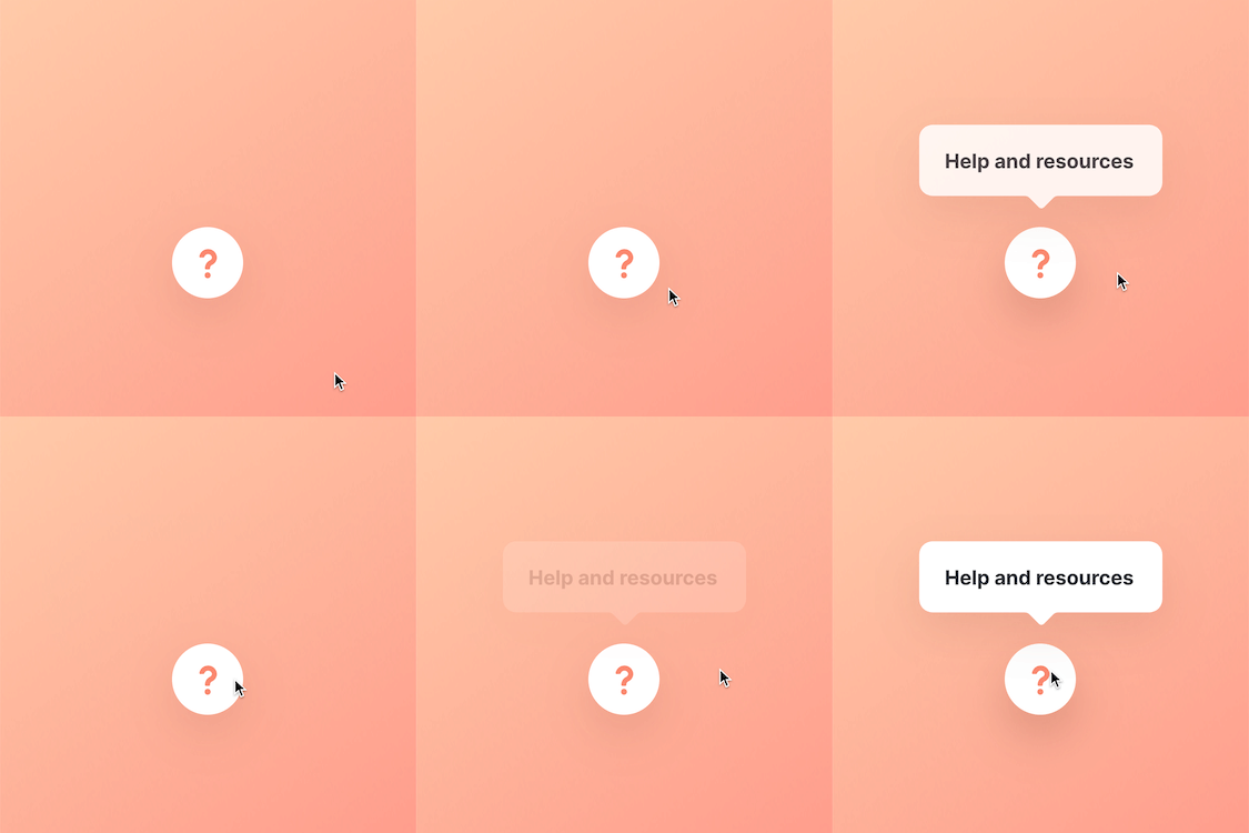.gif)
Step by step instructions
1. Make a Mouse-Over state for the question mark button
1. Select the Tooltip layer and set its opacity to 0.
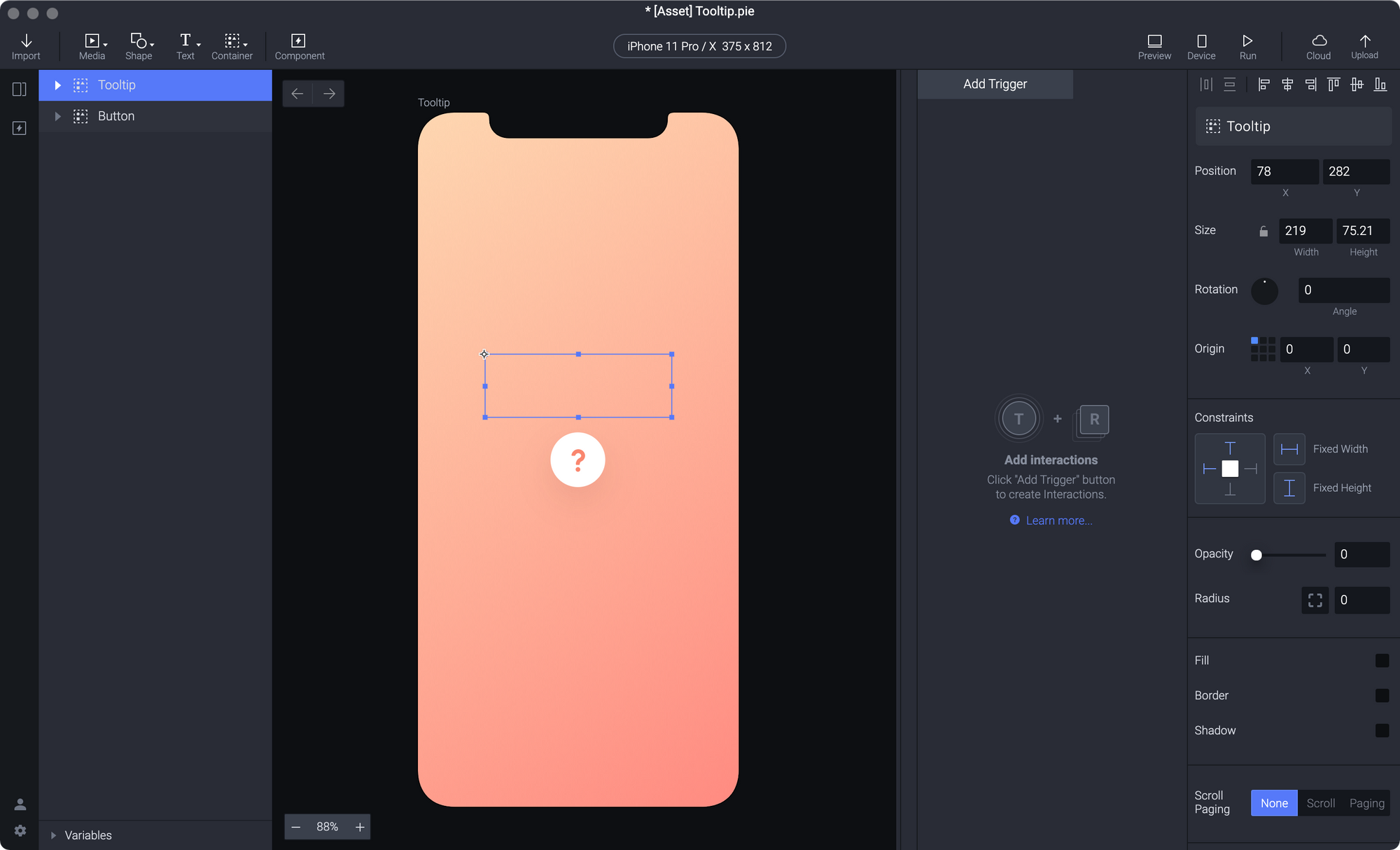
Since we want to make the Tooltip layer display only when we hover the mouse over the Button layer, we need to set the Tooltip layer invisible (opacity to 0) initially when the mouse is away.
2. Add a Mouse Over trigger to the Question mark button layer.

When the mouse cursor is brought over the Button layer, the responses under it would be triggered.
This is added to trigger a response when the user hovers the mouse on a certain UI element.
3. Add an Opacity response to the Mouse Over trigger. In the Opacity response set the opacity of the Tooltip layer to 100.
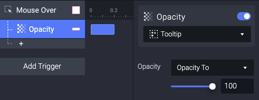
This will trigger the Tooltip layer to become visible when we hover the mouse over the question mark button layer.
4. Add a Shadow response to the Mouse Over trigger. And use it to change the BG layer under the Button layer. Here we just set the Fill value to 20, the Y value to 20, and the Blur value to 40. (You can always play with these values)
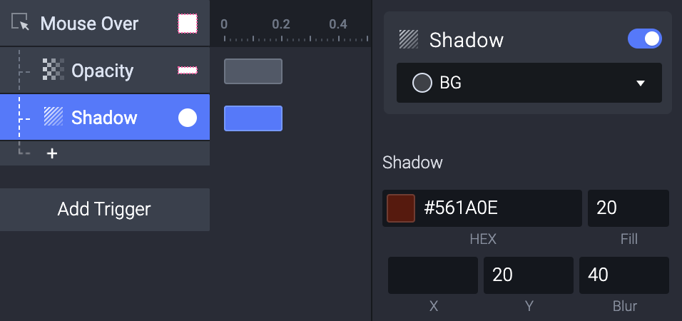
We use the Shadow response to highlight the question mark button whenever the user hovers the mouse over it.
5. Let's check in the preview window. Now if we get our mouse to hover over the question mark button layer the tooltip would appear.
.gif)
2. Make a Mouse-Out state for the question mark button
But the tooltip won't disappear if we move our mouse out of it. Hence, we need a Mouse Out trigger to tackle this.
1. Add a Mouse Out trigger to the Question mark button layer.
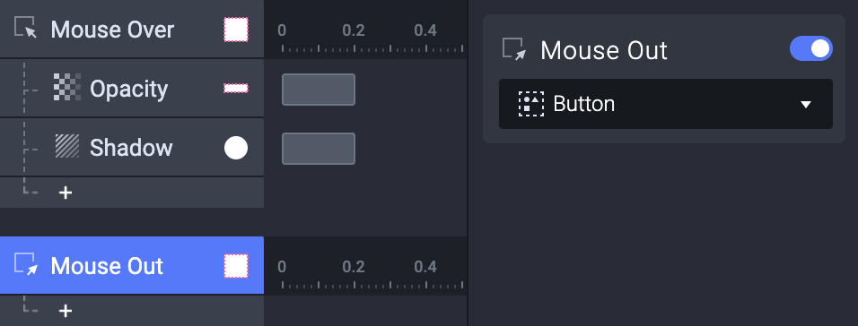
When the mouse cursor is brought outside the Button layer, the responses under it would be triggered.
2. Add two Reset responses to the Mouse Out trigger. Use one of the Reset responses on the Tooltip layer and use the other one on the BG layer.
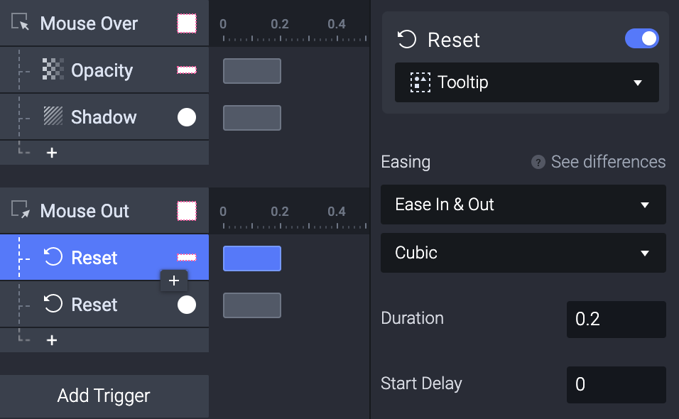
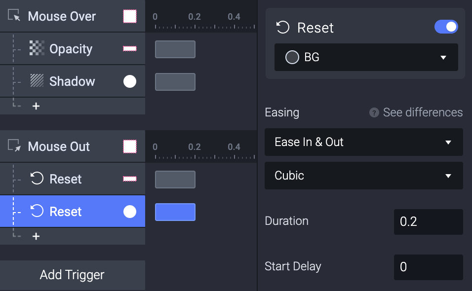
💡 Why do we use Reset?
We can use the Reset response to make a layer or a variable go back to its exact initial state. When we Mouse Out the Button layer, we want everything back to its initial state. So we can just use the Reset trigger this time.
The Reset response on the Tooltip layer will bring back the tooltip's opacity down to 0 and make it disappear while the other Reset on the BG layer will reset the shadow on the button.
3. Now try it out for yourself! It acts like a tooltip! However, if we hover over the upper part of the question mark button layer, the tooltip looks weird due to the difference in the applied layers.
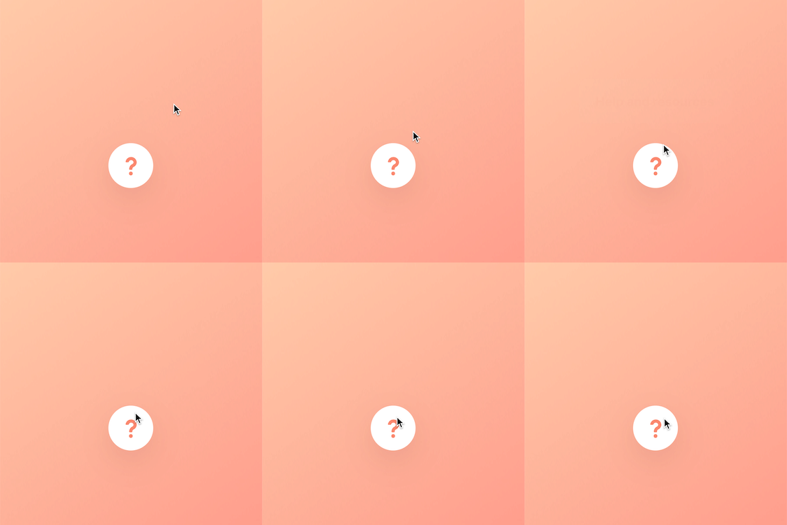
💡 Why is this happening?
If we select on the tooltipBG layer (which is inside the Tooltip layer), we'll see that it has an overlap with the Question mark button.
If we mouse over the overlapping part, 2 interactions will happen:
- Since we're mousing over the question mark button, the tooltip appears.
- Once the tooltip appears, it blocks our mouse on the question mark button, then the Mouse Out will be triggered.
4. Select the Tooltip layer and check the Make Lower Layers Touchable option in the property panel to fix this issue.
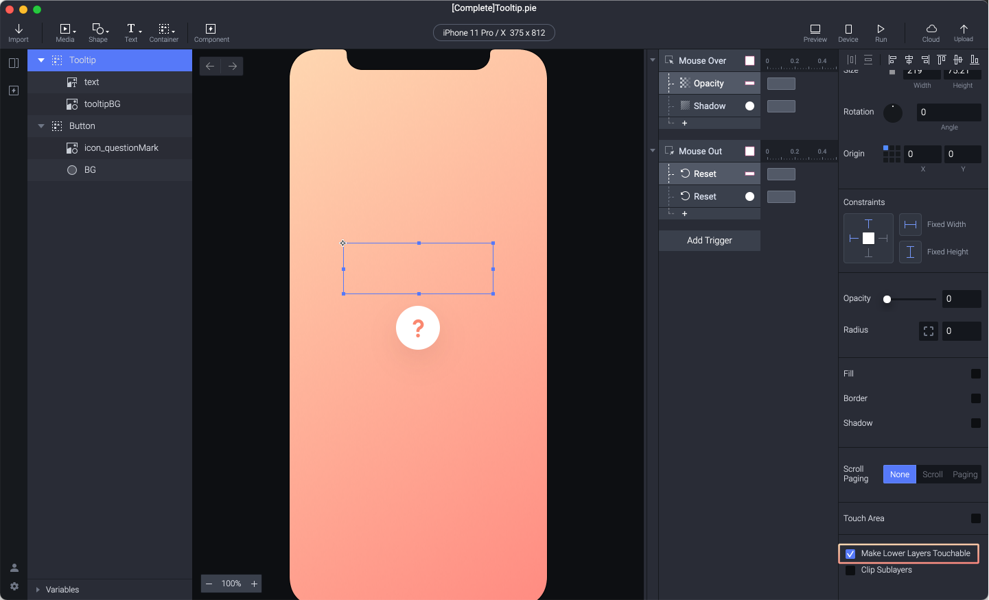
5. Let's check in the preview window. Now the lower layers of the Tooltip layer are touchable. This means that even if the Tooltip layer appears and we automatically hover our mouse on the Tooltip layer, the Mouse Out will not be triggered.
.gif)
Congratulations!
Finally, we learned how to make a working tooltip using Mouse over, Mouse out triggers, and Opacity responses. We also learned about some useful tips and tricks to achieve this effect in ProtoPie. Great work, you made it to the end of this tutorial!
Try playing around with these learnings and you will be able to create even more interesting interactions! We would love to see your crazy experiments. Create your own prototype and share it on Twitter or Instagram with #MadeWithProtoPie
