The Future of the ProtoPie Brand
Let's unveil the direction in which we're taking our branding.

.jpg?fm=webp)
Change is a constant, they say, and since late 2021, we've been hard at work, shaping up the next chapter of our ProtoPie brand. Today, we're thrilled to unveil the updates and showcase the direction in which we're taking our branding in this exciting new era. Let's dive in and explore these fresh changes that will make your ProtoPie experience even better.
Overview
Let's dive into the interesting updates happening with ProtoPie's branding!
As a designer, you probably understand the challenges of maintaining branding consistency. For visual designers, evolving a brand while retaining its essential characteristics and visual elements is quite a task. When I joined ProtoPie at the end of 2021, two things caught my attention about our brand: Pastel Gradients and 3D illustrations.
Pastel gradients are nice; they were meant to convey a sense of nurturing and care reminiscent of childhood's joyful exploration and playfulness. However, as we delved into understanding our audience, it became apparent that this design wasn't resonating with them as optimally as we wanted.
Moreover, applying pastel gradients presented a unique challenge. The contrast between the gradients and text often fell short of providing optimal readability, which was particularly noticeable when creating assets on a daily basis. This issue resulted in a lack of impact, with the gradient overpowering the text. It was evident that a solution was urgently needed.

Therefore our biggest challenge was figuring out how to evolve the branding while maintaining the familiar ProtoPie look and feel. We still wanted to maintain a sense of continuity because our identity was already established. This entire process was more like exploring and refining ProtoPie's brand identity.
Design principle: clarity and understanding
Our design principle remains unwavering amidst these branding updates – clarity and understanding. Every visual representation of ProtoPie must portray a clear message and leave no doubt in the viewer's mind.
In every step of our branding journey, we've prioritized this core principle, ensuring that our design not only captivates but also communicates effectively. Whether it's the choice of colors, the incorporation of 3D elements, or the use of gradients.
As we continue to evolve and refine our branding, clarity, and understanding will remain at the forefront of our design philosophy. We believe that clear communication is key to forging a deeper connection with our users, and we're dedicated to ensuring that every aspect of our brand reflects this commitment.

Team collaboration
Brand 🤝 product design
There aren't many resources available that explain how Branding/Visual design works alongside Product Design in tech companies. From my experience, each company has its unique way of managing these collaborations. Sharing insights about these practices is quite uncommon in the industry, as most teams tend to keep their internal operations guarded.
Moreover, collaboration can be challenging. Product Design teams often stick to a Design System that may not provide enough flexibility.
So, how do we find the right balance?
Within ProtoPie, our Design teams are organized by specific product areas. We have distinct roles, such as Product Designers and Website Designers, and my responsibility lies in Marketing Design and overseeing the branding and visual design aspects. Maintaining alignment among these teams presents its challenges, but at its core, it hinges on effective open communication and a continuous feedback loop.
We've adopted a practice of seamless information exchange, often soliciting opinions and insights across teams through direct synchronization. This approach has proven to be highly effective for us. Instead of adhering to a fixed schedule, which can sometimes impose unnecessary pressure on designers to share merely for the sake of it, we prioritize the quality and relevance of our exchanges. We opt to raise pertinent questions directly when the need arises and disseminate updates when they possess substantial value.
This approach fosters an environment where meaningful interactions take precedence, ensuring that each exchange adds value and contributes to the cohesion of our design efforts.
.jpg?fm=webp)
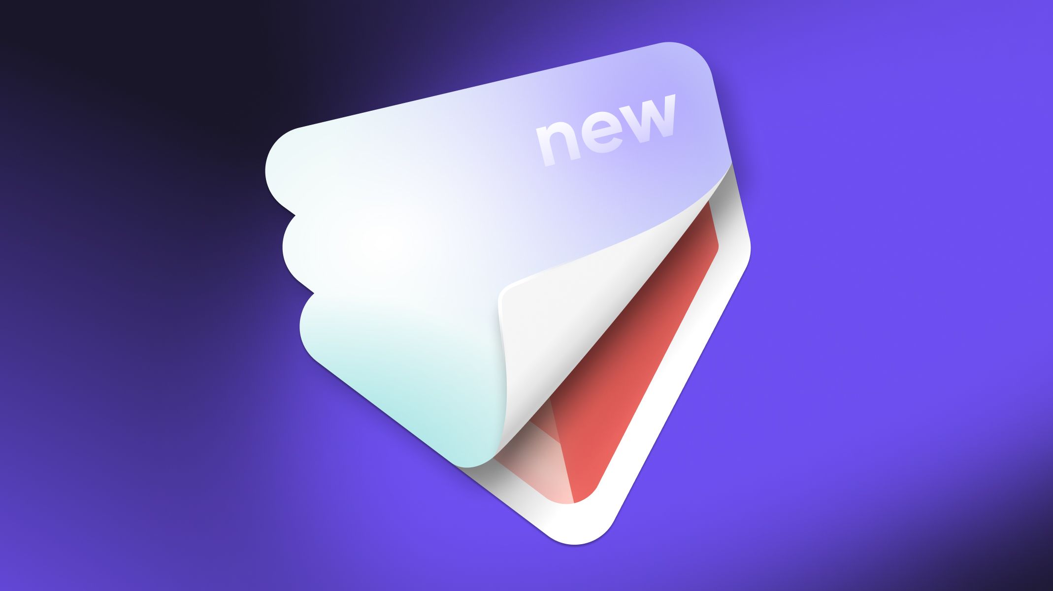
ProtoPie branding elements: colors, 3D illustrations, and gradients
Brand identity
At ProtoPie, our roots run deep in design, thanks to our CEO, Tony, who is a designer himself.
This collective creative spirit profoundly influences our communication style, which we've infused into our brand. Rather than adopting a traditional corporate tone, we aim to convey the warmth and informality of a casual gathering.
This approach is reflected in our branding designs. We draw inspiration from the world of baking and cooking, deriving it not only from our name but also from our 'Easy as Pie' slogan.
This influence is evident in the wavy shapes, textures, and playful illustrations of literal pies, forks, and related designs that characterize our branding—each serving as metaphors for our approach to creating intuitive digital experiences. Just as a baker combines ingredients to craft a delicious pie, we offer the products to “bake” outstanding interactive experiences.

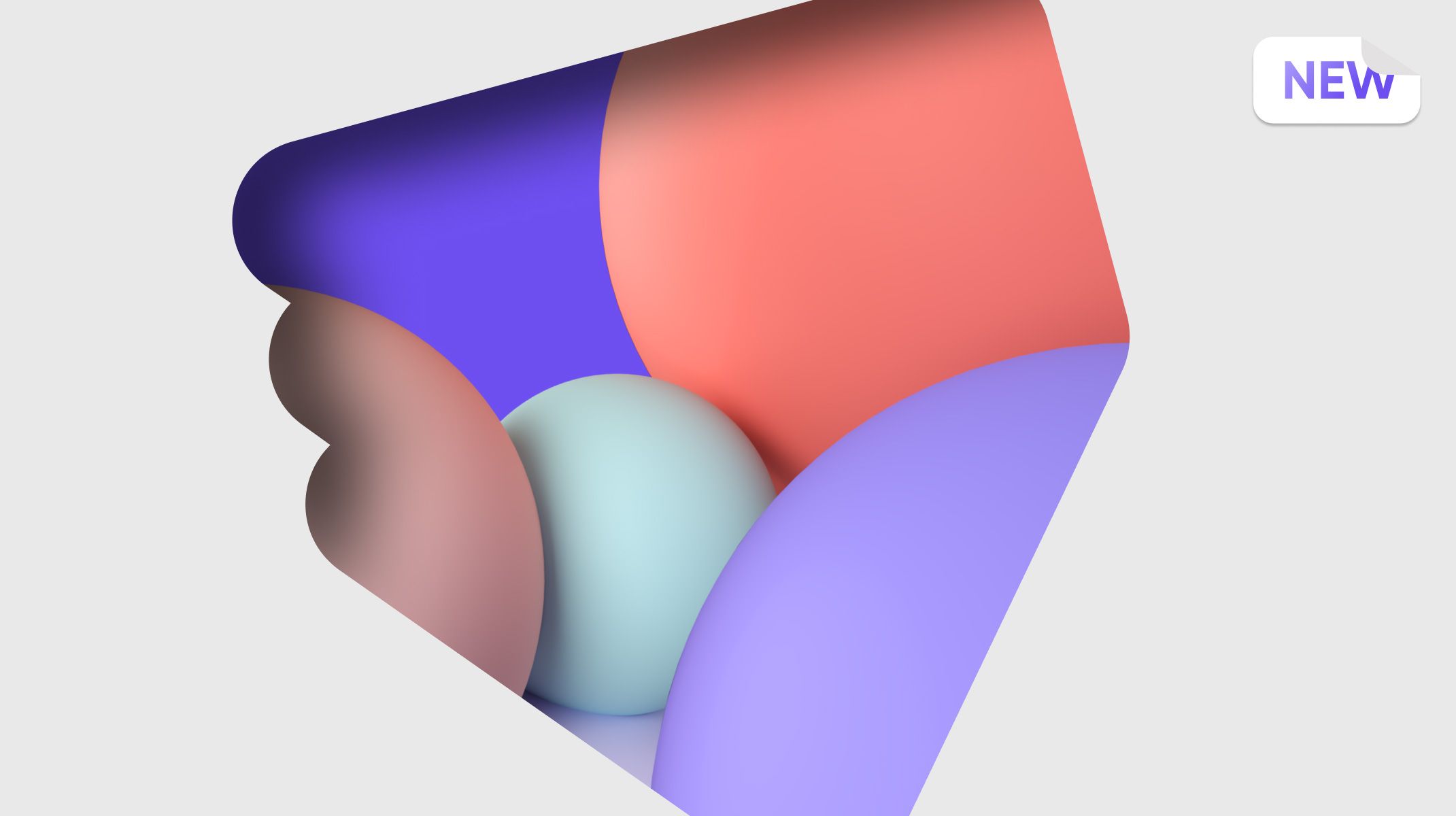
ProtoPie brand colors
Aligning our colors was relatively straightforward. To keep it simple - Coral, the color of our logo, purple, and teal – represent our product, accompanied by neutrals that are integral to our design system.
We also expanded our palette by introducing deeper shades, particularly within the purples, to enhance contrast and readability. These darker tonalities now play a pivotal role, especially in contexts like ProtoPie Connect or when communicating within industries like automotive and cross-device experiences.
However, their versatility shines through as we seamlessly blend these new tonalities with our trademark ProtoPie colors – Purple, Coral, and Teal. This fusion allows us to craft distinctive visual elements that are uniquely ProtoPie's own.
3D illustrations
We are well aware of the current popularity of 3D visuals, with many brands integrating them into their communication strategies. In our case, embracing 3D is a logical choice because it aligns seamlessly with the essence of our product. From IoT to Automotive, numerous designers now leverage ProtoPie to bridge the gap between physical products and the digital realm.
Also, integrating 3D elements enhances our ability to portray interactions like touch and voice more effectively compared to using 2D visuals. So, the 3D illustrations help us to provide a clearer depiction of how ProtoPie transforms abstract ideas into tangible, real-world experiences, and it’s also very versatile, so we can use it to replace photography in certain situations where it’s hard for us to have clear photography.
Gradients
The use of gradients enables us to communicate various emotions and moods through a range of color combinations.
This approach helps us to add visual depth and dimension to our branding, creating a sense of realism and making our visuals more engaging. Gradients are a powerful tool that enriches our design, allowing us to convey a wider spectrum of feelings and enhancing the overall brand experience.
ProtoPie brand timeline
Take a look at this visual timeline illustrating our brand's evolution since version 6.0. In the rightmost column, you can see our most recent updates, which we have started to apply across our product, ProtoPie Website, and Social Media channels.
Branding Design is an ongoing process requiring constant attention and improvement. However, we believe that this direction provides us with more flexibility and better aligns with our design principle of clarity. With these improvements, we've dedicated time to truly understand our brand.
One of the advantages of handling this work in-house is our deep understanding of the product and our own working processes. Therefore, rather than opting for a drastic and sudden rebrand, we've chosen to gradually and organically evolve the brand to the point where we are today. This approach ensures that as the product evolves, our branding evolves alongside it.
.jpg?fm=webp)
What’s next?
Our journey to enhance and refine ProtoPie's branding is an ongoing one. We are dedicated to staying at the forefront of design innovation and ensuring that our brand remains a true reflection of our commitment to clarity, creativity, and user-centricity.
In the pursuit of continuous improvement, we're thrilled to unveil some exciting developments on our horizon:
Brand resources: Watch for our expanding library of design resources, including an updated Branding Guidelines Document and refreshed assets across various touchpoints.
Elevated motion visual system: Recognizing that motion is at the heart of ProtoPie, we're actively crafting a dynamic motion visual system to inject even more vibrancy into our brand.
Evolved 3D illustrations: Our commitment extends to enhancing and expanding our 3D illustrations. We're dedicated to using these visuals to convey our content better and captivate our audience.
Proactive feedback: We want to hear from you! We're eager to gather your feedback on how you resonate with our brand and how we can improve. Feel free to reach out to us with your insights and suggestions. Your input plays a pivotal role in shaping the future of ProtoPie.
Thank you for being a part of our design journey. Together, we'll continue to shape the future of design with ProtoPie. Your feedback and support drive our commitment to excellence.


.jpg?fm=webp)