Crafting ProtoPie’s New Brand
How we embarked on a transformative journey to redefine who we are and aspire to be.

I wrote this article with Rina Park, brand designer for ProtoPie. Together we’d like to tell you our story–the transformative and fun journey of how we redefined who we are and aspire to be.
In case you never heard about us, ProtoPie is an advanced prototyping tool that enables users not only to create highly realistic prototypes without any coding skills but also to share and test them easily on any device.
Both our product and team have exponentially grown since our very first “Pie” was created in 2016. There have been some ups and downs but we worked hard as a team to overcome challenges and perfect the performance of our tool to provide users with the best possible product experience.
And it paid off! Today, ProtoPie helps design teams all over the world, from Google to Microsoft, simplify their everyday prototyping workflow while achieving great results. We recently launched our long-awaited 4.0 release which has received enthusiastic feedback from both longtime and first-time users.
As we started working on ProtoPie 4.0, we realized we had a problem: our brand image didn’t match our goals and spirit any longer.
So we embarked on a 6-month intensive journey into the core of our identity and values.
Why ProtoPie matters to users?
ProtoPie launched in 2016 as a response to a simple need: creating highly realistic prototypes quickly, without coding skills.
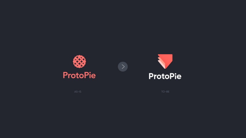
User-friendliness, speed, high-fidelity.
These were (and still are) the key points our users care about when choosing our tool over a similar one. For most of them, ProtoPie is more than just a handy tool, it’s a real time and money saver. A reliable problem-solver enabling them to create fast prototypes without sacrificing quality.
We wanted to craft a brand image that reflected those unique aspects in a more structured, powerful way.
What was our brand identity missing?
Prototyping complex interactions as easy as pie. That has always been our mantra and tagline.
And that’s also where our brand name comes from, a contraction of “prototyping” and “as easy as pie”.
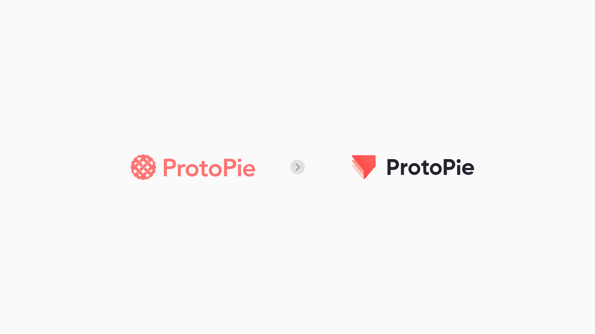
Naturally, the logo we adopted from day one represented a pie. A lattice pie crust seen from above, to be precise.
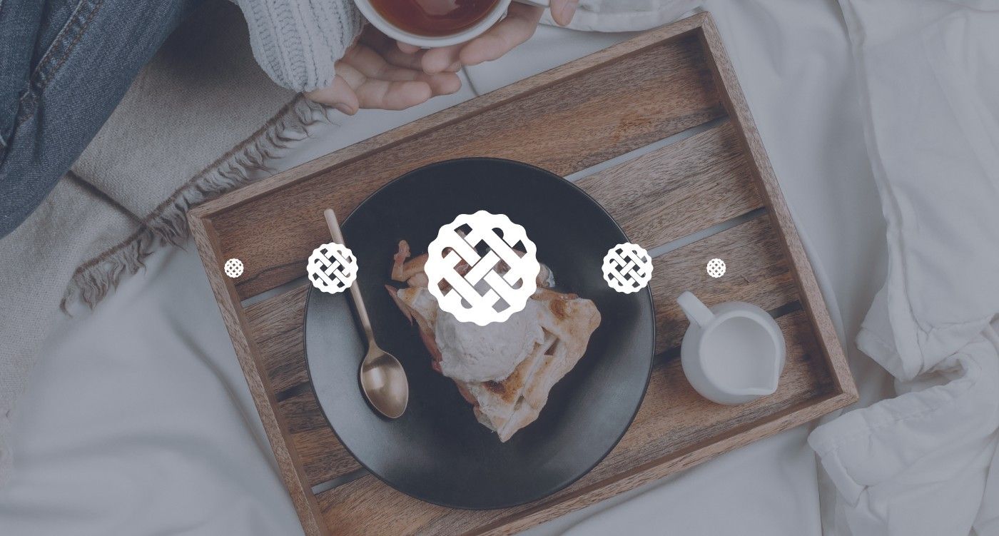
It felt friendly and warm, sure. But it also had big limitations that we had to cut loose from.
Firstly, it had too many details. When scaled down, the crisscrossed stripes would almost merge making it hardly recognizable.
Secondly, it didn’t fully match our core product attributes. Its look reminded people more of a dainty bakery than a powerful, user-friendly software, which ended up misleading new users more than once.
Finding our roadmap
We had identified the problem. Next step, we needed an action plan.
After carefully examining all options, we decided to narrow down the focus to two rebranding directions:
- Evolution - a process of simplification in which a logo is made simpler by looking at its design from multiple angles.
- Innovation - a process by which brand associations are reinvented with the purpose of changing how a product is perceived by users.
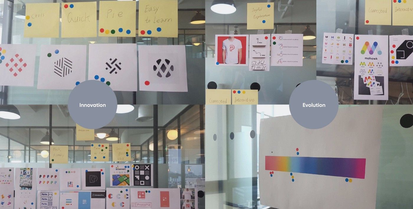
Revamping our logo: what has changed and what has stayed the same.
It wasn’t all bad. Our logo had limitations but also a few strengths that deserved to be maintained.
First, the pie symbol. No matter how we felt about it, the pie design was strongly associated with ProtoPie in everyone’s mind. It’s a powerful and highly emotional symbol evoking warm, comforting childhood memories. We couldn’t just dump it.
So, we decided that our rebranding approach would rather focus on creating new meaningful associations with ProtoPie’s core product features — a powerful, fast and user-friendly prototyping software — while keeping its original pie design. Power and Warmth, both dimensions coexist in ProtoPie.
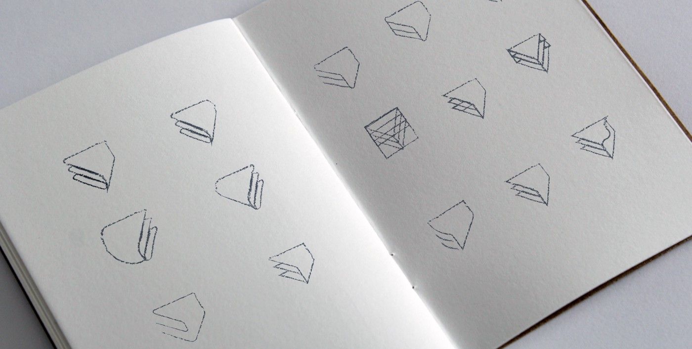
The pie logo, refreshed.
By combining the 3 units below we gave our sweet pie a complete makeover.
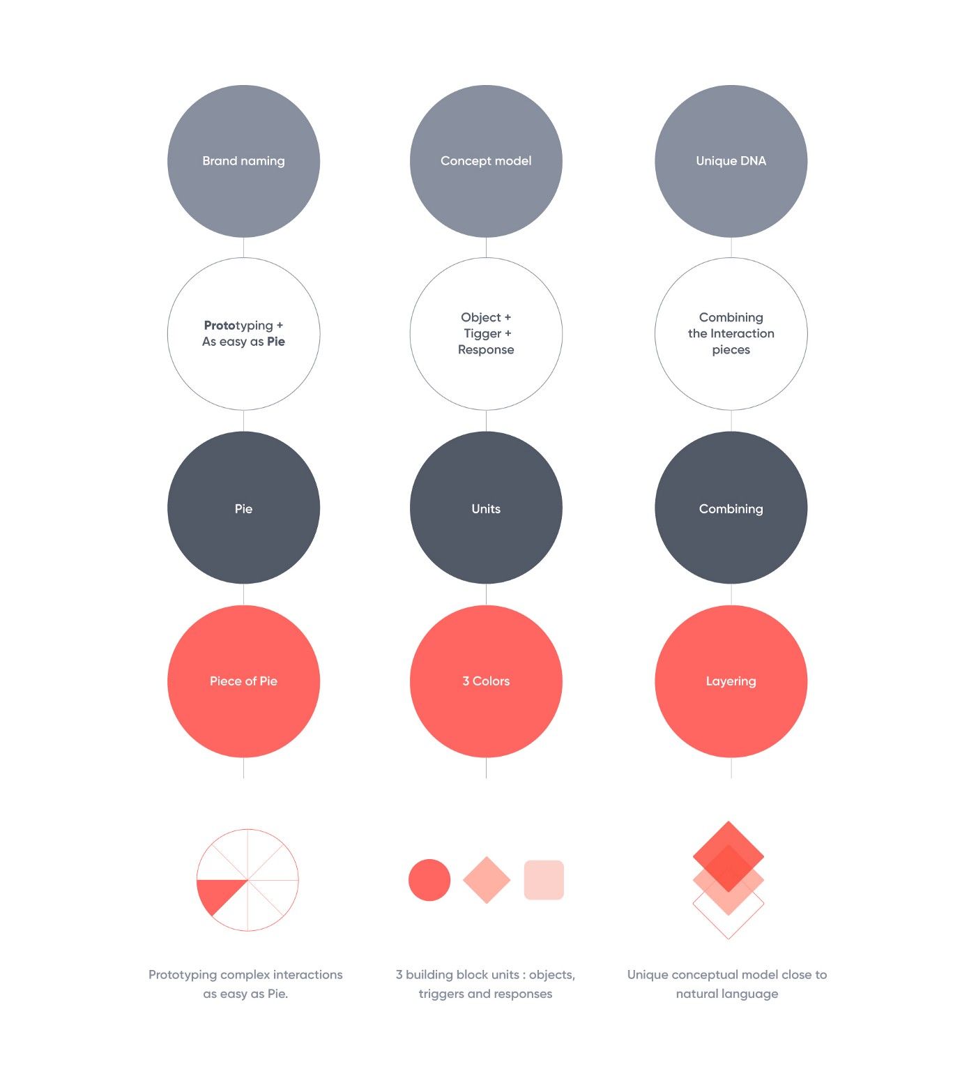
No more flat, intricate patterns. Instead, we designed a geometric, triple-layer slice of pie. As prototyping is both visual and logical exercise, we wanted our new logo to reflect this dualism. It had to be both imaginative and structured.
A well-balanced logo calls for a clear, well-organized grid system. We used a 1:1 square grid and divided it vertically with a 1.618 golden ratio. Inside it, we stacked three 50°-angled triangles with a constant radius.
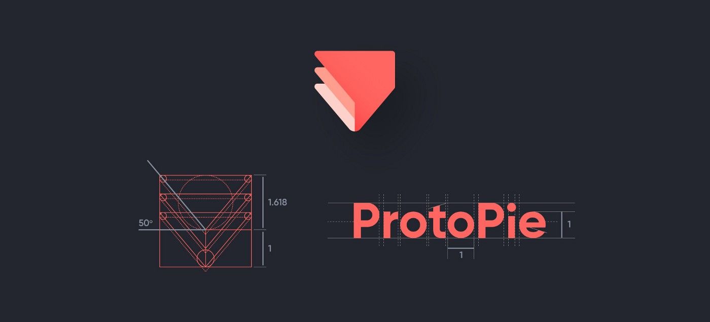
Finally, we had a logo that fits ProtoPie’s unique features and spirit. Now it was time to think bigger and define a set of consistent brand guidelines.
Building a brand system
We knew branding is not just about crafting a nice logo. It’s about creating a meaningful experience for users that reflects your core values and aspirations. If the logo is a beautiful sentence, the brand is the rich conversation flowing from it, connecting and inspiring everyone involved.
We needed to ensure our brand enriches users’ experience at every touchpoint and is recognizable wherever it appears.
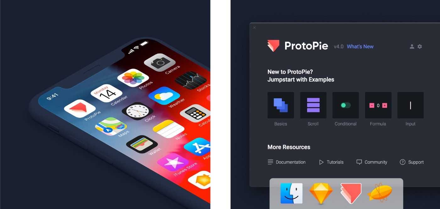
Typography, color, and composition are the first visual touchpoints visitors encounter in their journey to discover a product or repurchase. Our previous signature font was light and thin with soft color contrasts. A linear white text on a light grey base. We replaced it by a ticker font and changed its background color theme from light to dark. The font’s bolder contrast and weight strengthen the perception of ProtoPie as a reliable, powerful tool. Exactly what the old typography was failing to communicate.
We also needed a consistent color system. ProtoPie’s color palette was a total mess: Studio, Cloud, and Player were using different color shades although forming one single product system. We urgently needed clear guidelines.
Coral pink is still our dominant brand color. We just made it a little bit more vibrant and saturated. We needed a few secondary colors for the smaller details of our website and UI. We opted for a vivid Indigo blue coupled with splashes of pink, orange, and purple for the smallest elements. A mix of vibrant, energizing colors — the perfect palette for a fast and dynamic prototyping tool.

The new ProtoPie brand is confident, bold and energetic. A prototyping tool for those who are always ready to take on new challenges and grow, who think positively. This is the spirit we wanted to infuse into our new brand and overall, we are happy with the outcome and what this journey has taught us.
Today, we can look into ProtoPie’s future with confidence and optimism. The journey has been intense but great so far, still, we believe the best is yet to come.
